Data Analysis and Visualization to Improve Biopharmaceutical Operations Part 1: What Are You Trying To Measure?
November 16, 2017

Photo 1: Too much light behind your subject reduces your ability to see it well. A similar loss of vision occurs when organizational metrics get overcomplicated and numerous. (WWW. FREEIMAGES.COM)
This begins a five-article series of “how-to” guides for tackling the most common obstacles in assessing, measuring, analyzing, and improving the performance of global biopharmaceutical manufacturing operations. Each installment covers a component of proper collection, analysis, and use of data for the best possible performance outcomes. When taken as a whole, the series should provide imperative best practices for handling business-performance data.
First, consider what you want to know about your bioprocesses. How can you more appropriately measure those data in the right ways? “We’re drowning in data, but thirsting for information!” is a common refrain among biopharmaceutical companies when trying to understand their latest challenges. Every successful company measures a lot of things, often to a degree that not only does not help it, but actually undermines its ability to “see the forest for the trees.” Operational performance gets blotted out by unnecessary and spurious data collection and the pasting of metrics and charts all over physical spaces and corporate intranet bandwidth.
Don’t Backlight Your Subjects: One tenet of photographing people or other detailed subjects is to eschew putting those subjects between you and a strong light source. If you’re interested in conveying important details of a subject, you don’t want those to be
washed out by backlighting, which will happen if you compose a photo with its main subject silhouetted by overwhelmingly bright light (Photo 1).

Photo 2: Nobody’s ever read all of these metrics. (AUTHOR’S PHOTOGRAPH)
The same effect happens when metrics are posted all around a site or work location — whether physically or online (Photo 2). They become wallpaper or noise. Truly concerning process shifts or drifts can be obscured completely by data noise. In much the same way that a photo with a bright background overwhelms the photographic plate (in classic chemical print processes) or charge-coupled device (CCD) sensor (in digital imaging), too much data cluttering organizational settings (offices, manufacturing spaces, and quality control laboratories) will overwhelm viewers and prevents them from seeing important details. The “Alarm Fatigue” box describes a related problem.
Caution: Alarm Fatigue |
If we’re constantly exposed to some form of alarm — e.g., an auditory alarm from a distributed control system (DCS) or a visual signal continually calling for attention — without any consequence for leaving it unaddressed, we eventually become psychologically desensitized to its presence. In bioprocessing suites, frequent unimportant alarms can trigger a Pavlovian response just to silence them, often without even tracking down their root causes. That can lead to (and has done so many times) operators missing critical system alarms because of alarm fatigue. It also happens in office areas: e.g., when staff members are confronted with visible metrics on a process-improvement board or corporate metrics on an intranet site. With no incentive to read and act upon such signals, eventually employees will stop registering negative changes in those data or even looking at them at all. |
First Rule: What You Want to Know and Why It’s Important

Photo 3: Where should he direct his attention? Keep your measured metrics cogent and precise. “Measuring for the sake of measurement” is your enemy in this context. (HTTPS://STOCK.ADOBE.COM)
Different corporate departments try to justify their work and cost centers to the organization’s leadership team by publishing a never-ending series of trend charts describing whatever it is they do. Some of these metrics are useful; most are noise. To avoid getting caught in the same cognitive trap, you should first decide what you want to understand — to which, how to understand it is a subordinate question.
If you need to understand a critical cost of quality (CoQ) issue or the reasons for an apparent spike in defects over the past quarter, for example, probing your processes for important causal factors can help. Let’s say you’ve received some indication that quality control (QC) analytical testing is showing peculiar peaks and troughs coming from analyzed manufacturing samples. The first questions to ask in response might be
Were the assays confirmed to be valid?
What does the variation look like?
Were differences in QC testing staff associated with these results?
Were the samples taken by different manufacturing operators, on different shifts, or . . . ?
Consider too that within the manufacturing spaces and all throughout the QC labs, metrics and key performance indicators (KPIs) probably are posted to show how diligently their respective staffs are performing. None of those wallpaper metrics are likely to assist a company in identifying what’s gone wrong in this particular example for attempting to solve the problem.
On Leading Indicators: Many so-called “leading indicators” often get determined post-hoc: Someone recognizes a correlation in the data after some performance change, so those data are identified as leading indicators for future use only because they were cherry-picked as such. Don’t fall into this cognitive trap either! In a later installment of this series, I will describe proper methods of determining leading indicators by analyzing complex datasets.
Second Rule: Determine How You Will Measure It
Now that you know what you want to know, “how” to find that out becomes no less important — but remember, the “what” comes first. If you choose the wrong data-measurement methods, you’re likely to be pulled off the investigatory trail onto a new path that is related only tangentially to your business problems. In the example above of variation in different samples analyzed by a QC analytical laboratory, an investigator might need to measure the temporal nature of that particular issue rather than just obtaining a raw snapshot of “people committing errors.”
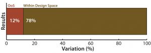
Figure 1: (top) QC analytical lab test performance bar graph shows that a 12% of samples tested showed excessive variation
In Figure 1, the first type of chart (top) gives a sense of the overall proportion of errors among samples tested, but it tells you nothing about how those defects occur over time.
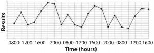
Figure 1: (bottom) time series plot shows recurring variation (spikes and troughs) that can be associated with shift-to-shift variation
The second type of figure (Figure 1, bottom) doesn’t just make senior leadership put out a mandate saying, “Reduce assay errors below x%.” Instead, it encourages problem solving by expressing the real issue. Just bearing witness to data architecture like that makes scientifically minded people say, “Hmmm, there seems to be some pattern to these assay problems. Does that coincide with anything inherent to sample processing and analysis?�” Measurement duration matters.
Third Rule: Proper Measurements for the Right Sample Period
Here lie a couple pitfalls: First, there is always a risk when installing a measurement system that employees will “game the system.” Second, measurement duration matters.
To the first point about gaming of systems within organizations: People are smart and naturally competitive, and they don’t want something monitoring their performance unless they’re sure it will put them in a positive light. To that end, some employees may subvert or circumvent monitoring systems if they feel that the outcomes could be a threat to their employment status. I have seen
electronic badging systems rigged to make lunches and breaks seem shorter than they actually were
batching of documentation work in a performance monitoring system to make certain individuals on certain shifts look extraordinarily productive
presigning good laboratory, manufacturing, and other practice (GxP) documentation before steps are performed to save the time of stopping after each step and thus document all steps sequentially
and many (many) other examples.
Many of those are breaches of GxP practice. But they are ubiquitous and tell us more about human behavior than we could ever understand by asking for honest feedback. The bottom line is that whenever you put into place a metric that incentivizes a particular result, you will encourage and reinforce behaviors that lead to that result regardless of how they get there.
The Hawthorne Effect: The very nature of organizational measurements creates a seductive situation for the Hawthorne Effect to take hold (1). The name comes from a psychological experiment in the 1920s and 1930s, when psychologists sought to understand the basis for performance improvement on a manufacturing line given different variables at play (shifts, widgets, and so on). The conclusion those researchers came to was that the act of simply being observed contributed an inordinate and significant effect to workers’ performance.

Photo 4: Measure the right things, but don’t create a panopticon.
We see that in other historical examples as well: e.g., the panopticon, Jeremy Bentham’s concept for prison design in which prisoners are held in the outer circumference of a columnar structure (2). The prison’s administrative spaces reside in the center of the column. The whole point of is to set up a psychological edifice wherein each prisoner’s cell can be watched covertly by guards in the central space. The principal behind this architecture is that prisoners will behave in a more conforming way if they think they are continuously watched by an unseen observer. Clearly ethical issues arise with the philosophical foundation of a panopticon, but the basic management tenet that “what gets measured gets done” is the business-speak equivalent of the premise underlying both the panopticon and the Hawthorne Effect — that is, changing behavior through observation (Photo 4).

Figure 2: Checksheets of QA tallies shows where errors occur within a batch record.
It’s possible to minimize the obtrusiveness of measurements within operational areas, and a good rule of thumb is that the more invisible and automatic are the systems for measurement, the better. Specifically, the quality tool called a “check sheet” is a typically manual document tallying something (or somethings) to keep a record of transactional data (Figure 2). For example, every time a GMP batch record is found to have an error upon QA review, a tick mark can be put on a check sheet along with typically another parameter of interest (such as day of the week, shift, section of record, extent of the excursion, and so on). That eliminates fallacious arguments from memory such as, “This batch record isn’t any more error-prone than these other ones.” The actual real-time QA-collected data are readily apparent and usable for problem-solving. With electronic batch records, errors can be detected and tallied by a computer system in real time — or even better, the electronic batch records (eBR) system won’t allow an operator to progress to the next step unless the previous step has been input properly (because prevention beats correction every time).
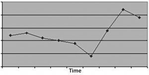
Figure 3: (top) When you don’t measure for long enough, the time-series plot doesn’t have enough data to discriminate an effect, leading to a conclusion of bias or no conclusive action at all, just no evidence of an effect.
Duration is another major potential pitfall. It is a mistake both not to measure a process for long enough and to measure it for too long with no end planned. I’ve often seen arbitrarily chosen measurement durations or the documentation of a corrective and preventive action (CAPA) committing to “measurement of process X to demonstrate (something)” with no end game.
In the first case, time windows that are too small will not provide statistically meaningful evidence for the nature of a problem or resolution of its root causes. Choose a measurement duration based upon how many “units” occur in a given period. For example, if you have a process that iterates only three times each week, then one month of measurement probably isn’t enough time to demonstrate a problem (or its resolution).
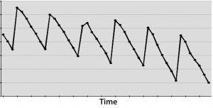
Figure 3: (bottom) A cyclical effect repeats X times, and not applying CAPA allows for many instances that could have been averted.
On the other hand, if you have a DCS system polling instruments second by second — or even dozens of times per second — then measuring for a month or more could cost your business more in lost time and opportunity than it’s worth. In such cases, only a few days would give you sufficiently thousands of data points from which to draw meaningful inferences. Spending more time measuring for measurement’s sake can cost a business in potential defects that are not resolved soon enough (Figure 3).
Looking Ahead: Asking the Right Questions
In the next installment of this series, I will present more in-depth ways to keep from choosing the wrong parameters to measure. For any CAPA to be effective, it must be properly determined and selected by identifying and understanding the signal within the data noise. Choosing the right things to measure will ensure that you’re not just chasing noise.
Reference
1 Cherry K. What Is the Hawthorne Effect? VeryWell 27 July 2017.
2 Mason MK. Foucault and His Panopticon. 2017; www.moyak.com/papers/ michel-foucault-power.html.
Ben Locwin, PhD, MBA, MS, MBB, is president of Healthcare Science Advisors; [email protected]. He has provided insight and breakthrough performance for many Fortune-500 companies — principally in healthcare, but also the food and beverage, aerospace, automotive, and oil and gas industries. Follow him on Linked In and Twitter@BenLocwin.
You May Also Like


